As a head of production at Hemblem, I was responsible of the rebranding of the agency. We took care of it along with two friends and colleagues: Joffrey, a graphic designer and Ambre, an illustrator.
Hemblem is a social media agency that helps businesses shine on social networks. We wanted something fun & hip, but also techy and slick.
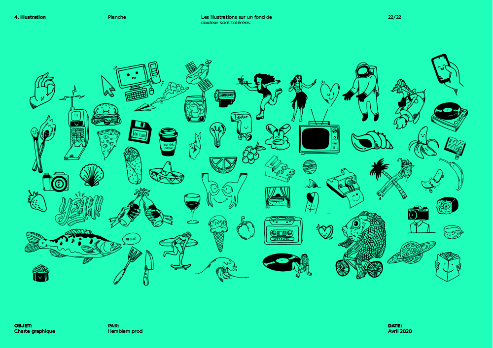
After many talks and propositions we went for the following recipe :
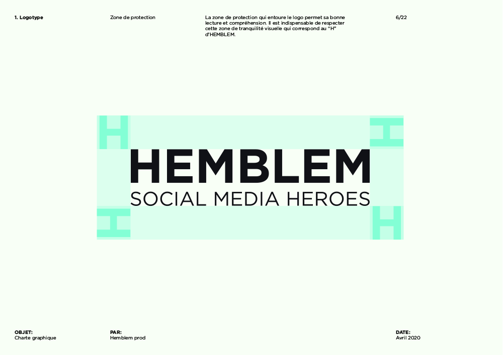
- - A simple, clean and raw logo. (slick)
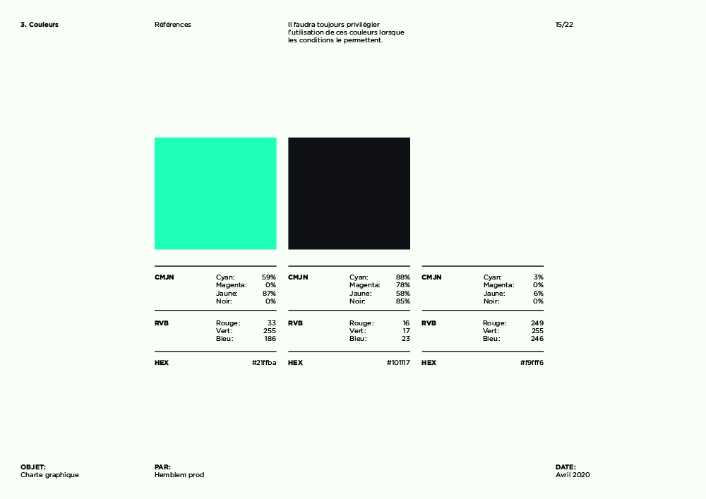
- - A slightly saturated black and white along with a pop primary sea green. (techy)
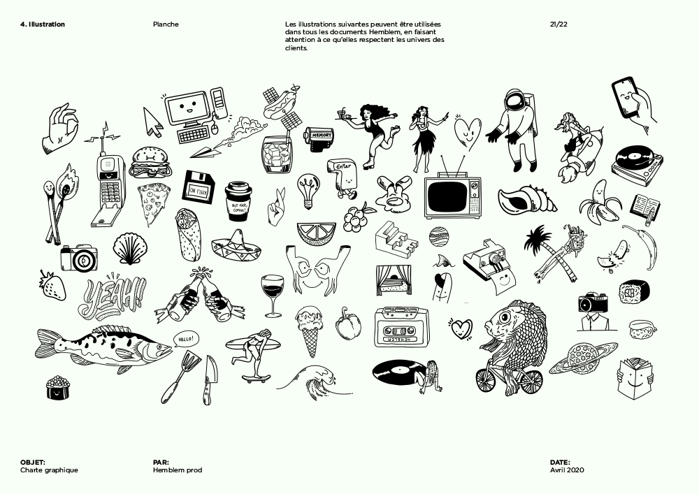
- - Some flash tatoos's inspired illustrations. (fun & hip)
We delined the identity in various formats, I was in charge of manging the whole project and personally realised all the motion design content, as well as about half of the illustrations.